Similar Products to Mind the Graph for Research Report Figures (2026)
Linda
Compare Mind the Graph alternatives for research report figures, including Noah AI, BioRender, Canva, Flourish, ggplot2, and Inkscape, with a real PubMed-informed Noah case study.
A research report figure has a different job from a poster graphic or a presentation slide. It must remain readable at page width, support a specific analytical claim, and help the reader compare evidence without implying more certainty than the sources justify.That distinction matters when comparing products similar to Mind the Graph. Mind the Graph is built around scientific illustrations, templates, and visual assembly. Its official site advertises more than 75,000 scientific illustrations and 300-plus templates across more than 80 fields. That makes it useful when the scientific message is already defined and the main task is arranging recognizable assets into a polished visual.But research reports often contain several other figure jobs:
- converting literature into an evidence landscape;
- turning a dataset into a reproducible chart;
- creating an interactive visual for a digital report;
- assembling a complete report page;
- drawing a biomedical schematic manually; or
- finishing a figure as precise vector artwork.
No single tool is best at all six. The useful question is not “Which tool looks most like Mind the Graph?” It is “Which bottleneck is preventing this report figure from being completed?”
Quick answer
Noah AI is the strongest fit in this comparison when a biomedical report figure must begin with a research question or PubMed evidence. It can retrieve literature, organize the content into a first visual structure, and accept natural-language revisions.
BioRender is a better fit when the scientific content is already settled and the priority is manual assembly with biomedical icons and templates.
Canva is useful for full-report layout and general infographics.
Flourish is designed for interactive, data-led stories.
ggplot2 is the best option here for reproducible charts generated from structured data.
Inkscape is the free vector editor for precise finishing.None of these choices removes the need to verify scientific claims, labels, units, citations, and visual relationships before publication.
Best Mind the Graph alternatives for research report figures at a glance
| Tool | Best report-figure job | Main strength | Less suitable when |
|---|---|---|---|
| Noah AI | Literature-informed biomedical comparison or mechanism draft | Research question and PubMed context to a structured visual draft | The content is already final and only pixel-level editing remains |
| BioRender | Manual biomedical schematics | Editable scientific icons, templates, and canvas tools | The difficult part is synthesizing several papers into the visual argument |
| Canva | Complete report pages and general infographics | Templates, layout, brand assets, charts, and collaboration | Biomedical terminology and evidence structure are the main challenge |
| Flourish | Interactive data stories for digital reports | No-code, responsive, animated data visualizations | The report needs a static biomedical mechanism or evidence diagram |
| ggplot2 | Reproducible statistical and data figures | Declarative, code-based graphics built from data | The figure is mainly an illustrated scientific concept rather than a dataset |
| Inkscape | Final vector cleanup and custom composition | Free, open-source SVG editing with precise control | The user needs literature retrieval or an automatically proposed structure |
What makes a research report figure different?
A report figure is successful when it reduces the work required to understand the report’s argument. Visual polish matters, but it is secondary to analytical clarity.For tool selection, evaluate five things:
- Evidence grounding. Can the workflow preserve the link between the figure and its source literature or dataset?
- Comparison structure. Can it organize parallel categories, criteria, mechanisms, or outcomes without creating a false ranking?
- Page-width readability. Does the figure still work when inserted at approximately 6.5 inches wide in a Word or PDF report?
- Revision speed. Can a researcher correct hierarchy, terminology, density, and emphasis without rebuilding everything?
- Final control. Can the team edit labels, vectors, colors, citations, and export settings to meet its publication requirements?
The best workflow may combine tools. For example, a team can use Noah for evidence-to-draft synthesis, ggplot2 for quantitative panels, and Inkscape for final vector assembly.
- Noah AI: best for literature-informed biomedical report figures
Noah approaches the task from the research side. Its scientific figure workspace accepts a biomedical prompt, retrieves supporting information, generates a visual draft, and supports follow-up edits. Noah’s official product material describes Search as a way to retrieve evidence from sources such as PubMed and Agent as a workflow for multi-study analysis and reusable reports.This positioning is important. When a researcher already knows every box, arrow, and sentence, a manual editor may be enough. When the real bottleneck is deciding what the evidence should become visually, Noah addresses an earlier part of the workflow.
Real Noah case: an RNA-delivery platform landscape for a research report
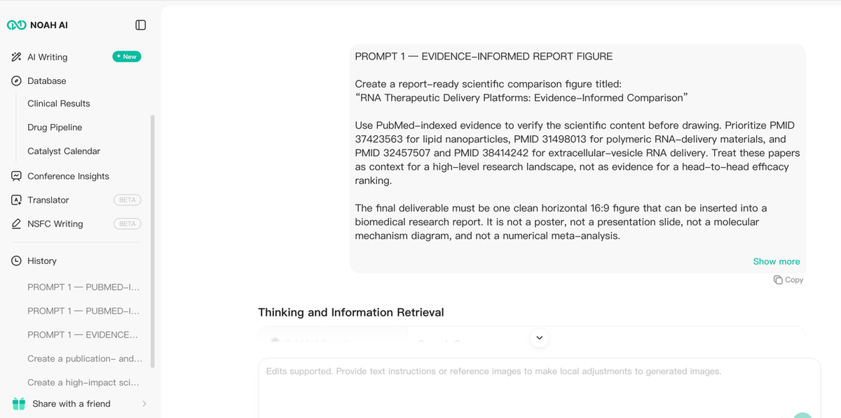
To test that claim, we asked Noah to create a report-ready comparison of three RNA therapeutic delivery platforms:
- lipid nanoparticles (LNPs);
- polymeric nanoparticles; and
- extracellular vesicles (EVs).
The prompt explicitly prioritized four PubMed records: PMID 37423563 for LNPs, PMID 31498013 for polymeric RNA-delivery materials, and PMID 32457507 plus PMID 38414242 for EV-mediated RNA delivery. These reviews do not constitute a controlled head-to-head comparison, so the prompt prohibited scores, traffic-light ratings, and a universal winner.
Noah returned a three-column comparison with aligned rows for architecture, strengths, constraints, and development fit.
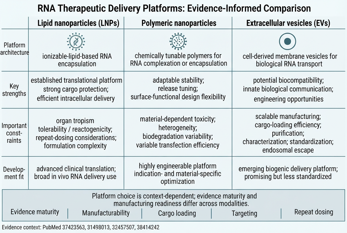
The first draft proved the central advantage: it did not merely provide icons. It converted literature context into a coherent comparison structure and resisted the request’s forbidden “winner” framing.It also exposed genuine limitations. The image was 1264 × 848 rather than a strict 16:9 canvas. Two left-hand row labels used awkward hyphenated line breaks. Some cells were too dense for page-width placement. These are exactly the details that a workflow-only demo can hide, so they should remain visible in an honest case study.We then gave Noah a natural-language revision instruction: standardize all row labels, shorten every cell, remove any ranking cues, emphasize the “no universal winner” conclusion, correct malformed text, preserve the PubMed footer, and use a strict 16:9 report layout.
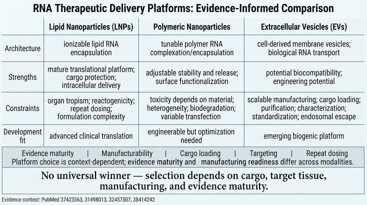
Figure 3. The revised 1376 × 768 output uses a true 16:9 layout, consistent row labels, shorter phrases, a neutral decision lens, and a prominent context-dependent conclusion.The revision materially improved the figure. It fixed the aspect ratio and most readability problems without requiring the researcher to reconstruct the full matrix.
What the case proves about Noah
The case supports three product advantages:
- Evidence-to-structure translation. Noah retrieved relevant PubMed literature and turned a broad research question into a parallel comparison, not a generic lab illustration.
- Research-aware restraint. The output did not invent numerical superiority from non-comparative review literature. It kept the conclusion context-dependent.
- Natural-language global revision. A single follow-up instruction changed the canvas ratio, row consistency, text density, and conclusion hierarchy across the figure.
The case does not prove that Noah outputs are publication-ready without review. Researchers still need to verify every claim against the cited papers, check terminology and visual relationships, and decide whether the final journal, client, or institution permits AI-assisted conceptual figures.
- BioRender: best for manual biomedical schematic assembly
BioRender is the closest specialist alternative when the report needs a conventional biomedical schematic. Its official template library positions the product around editable scientific icons and publication-quality templates, while its updated canvas includes smart search, template recommendations, tables, alignment tools, and AI features.Choose BioRender when:
- the scientific content has already been defined;
- the report needs recognizable biomedical assets;
- collaborators need to move, recolor, align, and annotate individual elements; or
- detailed manual control matters more than evidence retrieval.
BioRender and Noah solve adjacent problems. Noah is more relevant when the team is still moving from research context to a defendable visual structure. BioRender is stronger when that structure is settled and the team wants a dedicated scientific design canvas.
- Canva: best for full research-report layout
Canva is not a biomedical evidence tool, but it is useful when the figure must live inside a visually consistent report. Canva’s official report maker combines editable report templates, drag-and-drop layout, images, illustrations, icons, shapes, charts, branding, and collaboration.Choose Canva when:
- the main deliverable is the complete report rather than one specialist scientific figure;
- visual consistency across covers, section pages, callouts, and simple charts matters;
- non-designers need a familiar layout environment; or
- the scientific panels have already been generated elsewhere.
Its weakness for this use case is upstream reasoning. Canva can make a comparison look clear, but it does not by itself establish which scientific categories or claims belong in that comparison. Evidence synthesis must happen before layout.
- Flourish: best for interactive data stories
Flourish is useful when the research report will be read online and the evidence is structured as data. Its official product pages describe no-code templates for charts, maps, hierarchies, surveys, animation, scrollytelling, responsive display, publishing, and download.Choose Flourish when:
- readers should filter, hover, explore, or move through the data;
- a static figure would hide important dimensions;
- the report is primarily digital; or
- the team needs a no-code data-storytelling workflow.
Flourish is less suitable for a literature-derived biomedical comparison with illustrated modalities and qualitative development constraints. It visualizes data well; it does not replace scientific interpretation.
- ggplot2: best for reproducible data-driven report charts
ggplot2 is an R package for declaratively creating graphics from data. Its official documentation describes a grammar-of-graphics workflow in which the user supplies data, maps variables to aesthetics, and adds layers, scales, facets, coordinates, and themes.Choose ggplot2 when:
- the report figure must be reproducible from an analysis dataset;
- the team needs consistent styling across many charts;
- statistical panels must update when data change; or
- code and version control are part of the research workflow.
ggplot2 is not a drag-and-drop substitute for Mind the Graph. It is a better tool for another report job: turning analyzable data into traceable plots. A common combined workflow is to export ggplot2 panels as SVG or PDF and assemble them with schematic elements in a vector editor.
- Inkscape: best free option for vector finishing
Inkscape is a free, open-source vector graphics editor that uses SVG as its main format. It is appropriate when a researcher needs exact control over paths, typography, alignment, line weight, panel composition, and final export.Choose Inkscape when:
- the report requires precise vector artwork;
- figures from several tools need to be assembled into one plate;
- the team wants a free alternative to a commercial vector editor; or
- final cleanup is more important than automatic content generation.
Inkscape does not retrieve literature or propose the scientific argument. It is a finishing environment. That makes it complementary to Noah, ggplot2, Flourish, or exported figures from other tools.
How to choose the right Mind the Graph alternative
Use this decision rule:
- Start with Noah AI if the hard part is turning biomedical literature or a research question into a structured visual draft.
- Start with BioRender if the content is settled and you need to assemble a biomedical schematic with editable scientific assets.
- Start with Canva if you are designing the entire report and the figure is one component of the page system.
- Start with Flourish if the report is digital and readers should interact with structured data.
- Start with ggplot2 if reproducibility and data-to-chart traceability are the priority.
- Start with Inkscape if you already have the content and need exact vector finishing.
For many teams, the right answer is a stack rather than one product. A literature-informed review report might use Noah to draft a modality landscape, R to generate quantitative charts, and Inkscape to assemble the final multipanel figure.
A practical QA checklist for AI-assisted research report figures
Before placing any AI-generated figure in a report:
- Open every cited paper and confirm that it supports the nearby claim.
- Check that non-comparative evidence has not been converted into a ranking.
- Verify terminology, capitalization, abbreviations, units, and compound names.
- Inspect every arrow, row relationship, and category boundary.
- Test the figure at the actual report width—not only in a full-screen preview.
- Confirm that the evidence footer is readable and complete.
- Remove redundant conclusions and reduce dense cells.
- Recreate or edit elements that remain inaccurate or visually malformed.
- Follow journal, client, institutional, and AI-disclosure requirements.
Frequently asked questions
What is the best Mind the Graph alternative for a biomedical research report?
Noah AI is a strong choice when the report figure must begin with literature context or a biomedical question. BioRender is better when the visual structure is already known and manual scientific-asset editing is the priority. For reproducible data charts, use ggplot2; for final vector finishing, use Inkscape.
Can Noah AI replace Mind the Graph completely?
Not for every task. Noah is differentiated by research-to-figure synthesis and natural-language iteration. Mind the Graph remains useful for template- and illustration-based visual assembly. A team may use Noah for the first evidence-informed draft and another editor for precise final production.
Can AI-generated scientific figures be published directly?
They should not be treated as automatically publication-ready. Verify the scientific content, edit visual errors, retain source traceability, and follow the target publisher’s current policy and disclosure rules.
Which tool is best for figures generated directly from research data?
ggplot2 is the strongest option in this list for code-based, reproducible charts. Flourish is preferable when interactive exploration is important and a no-code workflow is desired.
Which free tool is best for final figure editing?
Inkscape is the clearest free vector-finishing option. It can edit SVG artwork and assemble panels, but it does not perform literature synthesis or scientific fact checking.
Final takeaway
The closest-looking Mind the Graph alternative is not automatically the best product for a research report. The better question is which part of the figure remains difficult: interpreting literature, drawing biomedical assets, visualizing data, building the report page, enabling interaction, or finishing precise vector artwork.The Noah RNA-delivery case demonstrates a meaningful product advantage. Noah can turn a biomedical landscape question into a PubMed-informed comparison draft, expose structural and readability problems for review, and respond to natural-language revisions. For researchers who otherwise move manually from papers to notes to a blank report page, that research-to-figure bridge is more valuable than another illustration library.
Turn your next biomedical research question into a researcher-reviewable report figure with Noah AI.