Best Mind the Graph Alternatives for Biomedical Comparison Figures (2026)
Linda
Compare the best Mind the Graph alternatives for biomedical comparison figures, with a real PubMed-informed Noah AI test covering apoptosis, pyroptosis, and ferroptosis.
Article draft
A biomedical comparison figure must do more than place three attractive illustrations next to one another. It needs to make the comparison logic visible: the same criteria, in the same order, expressed at a similar level of detail. If one column describes mechanism, another morphology, and the third clinical relevance, the figure may look polished while remaining analytically weak.That is why the best Mind the Graph alternative depends on the bottleneck. Mind the Graph is a scientific design platform with a large illustration library, editable templates, and a drag-and-drop workflow. Its official site currently describes more than 75,000 scientific illustrations, more than 300 templates, and coverage across more than 80 fields. It is a sensible choice when the scientific message is already settled and the remaining work is visual assembly.Other projects start earlier. The team may still need to interpret papers, choose fair comparison criteria, prevent a review article from becoming a false quantitative ranking, and convert the result into a figure that a researcher can challenge. That earlier evidence-to-structure problem calls for a different kind of product.
Quick answer
Noah AI is the strongest option in this comparison when the figure must begin with a biomedical question or PubMed evidence. It can retrieve research context, propose a structured visual, and respond to natural-language revisions.
BioRender is the stronger manual canvas when the content is already defined and the user wants editable biomedical assets.
Canva is useful for fast general comparison infographics and team layout. Bioicons plus Inkscape offers an open-source asset-and-vector workflow. Adobe Illustrator provides the most exact manual vector finishing.
PowerPoint remains practical for familiar, presentation-led comparisons.No option removes scientific review. Before publication, verify every label, relationship, citation, symbol, and implied claim.
Best Mind the Graph alternatives at a glance
| Tool | Best for | Main advantage | Less suitable when |
|---|---|---|---|
| Noah AI | PubMed-informed biomedical comparison drafts | Bridges research context, comparison structure, generation, and natural-language revision | Every label must already be locked and edited at the vector-object level |
| BioRender | Manual biomedical figure assembly | Scientific icons, editable templates, and a domain-specific canvas | The hard part is deciding what several papers mean together |
| Canva | General comparison infographics and presentation layouts | Fast templates, collaboration, charts, and broad design assets | The figure requires domain-specific evidence interpretation |
| Bioicons + Inkscape | Open-source scientific assets with manual vector composition | Reusable scientific icons plus precise SVG editing | The user wants automated literature synthesis or an instant first draft |
| Adobe Illustrator | Publication-grade vector finishing | Exact typography, paths, layers, alignment, and export control | Speed and a low learning curve matter more than precision |
| PowerPoint | Familiar presentation and internal-report figures | Accessible layout, shapes, comments, and easy team handoff | The figure needs complex vector artwork or evidence retrieval |
What makes a good biomedical comparison figure?
The final product should let a reader answer a specific question faster than prose alone. Five checks matter.
- Parallel criteria. Every modality should be compared using the same rows rather than whichever facts happen to be easiest to illustrate.
- Comparable granularity. One column should not contain molecular detail while another remains a vague summary.
- Neutral framing. Review literature rarely supports a universal winner, diagnostic rule, or numerical score.
- Page-width readability. Labels must remain legible when the figure is inserted into a manuscript, report, or slide.
- Researcher-reviewable claims. A scientist should be able to trace and correct each distinction instead of accepting a decorative black box.
These requirements also explain why a hybrid workflow is often best. A team might use Noah to structure the evidence, BioRender or Bioicons for assets, and Illustrator or Inkscape for final production.
1. Noah AI: best for PubMed-informed biomedical comparisons
Noah starts closer to the research question than a conventional drag-and-drop editor. Its scientific-figure product page describes a workflow that can fetch PubMed papers, organize evidence into a structured figure, support uploaded files, and accept iterative instructions. It also distinguishes a visually polished mode from a higher-density logic mode.That positioning matters when the user does not yet know the final boxes and labels. Instead of opening a blank canvas and manually translating notes into rows, the researcher can ask for a comparison with explicit evidence boundaries, review the proposed structure, and then revise it.
Real Noah case: apoptosis vs pyroptosis vs ferroptosis
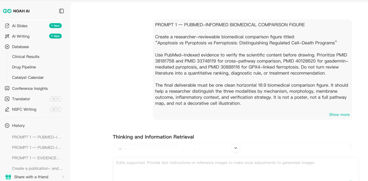
We tested Noah with a difficult but practical task: create a researcher-reviewable comparison of three regulated cell-death programs—apoptosis, pyroptosis, and ferroptosis.The prompt prioritized four PubMed records: PMID 38181758 and PMID 33748119 for cross-pathway context, PMID 40128620 for gasdermin-mediated pyroptosis, and PMID 30888116 for the GPX4-linked ferroptosis defense axis. It prohibited quantitative rankings, diagnostic certainty, and treatment recommendations.The final target was precise: a horizontal 16:9 figure with three equal columns and five aligned rows—execution, morphology, membrane outcome, inflammatory context, and verification. The prompt also required a bottom interpretation band stating that no single marker is sufficient.
The first output already showed the main product value. Noah turned a dense scientific request into a recognizable comparison matrix with a title, parallel columns, aligned criteria, an interpretation band, and a PubMed evidence footer.
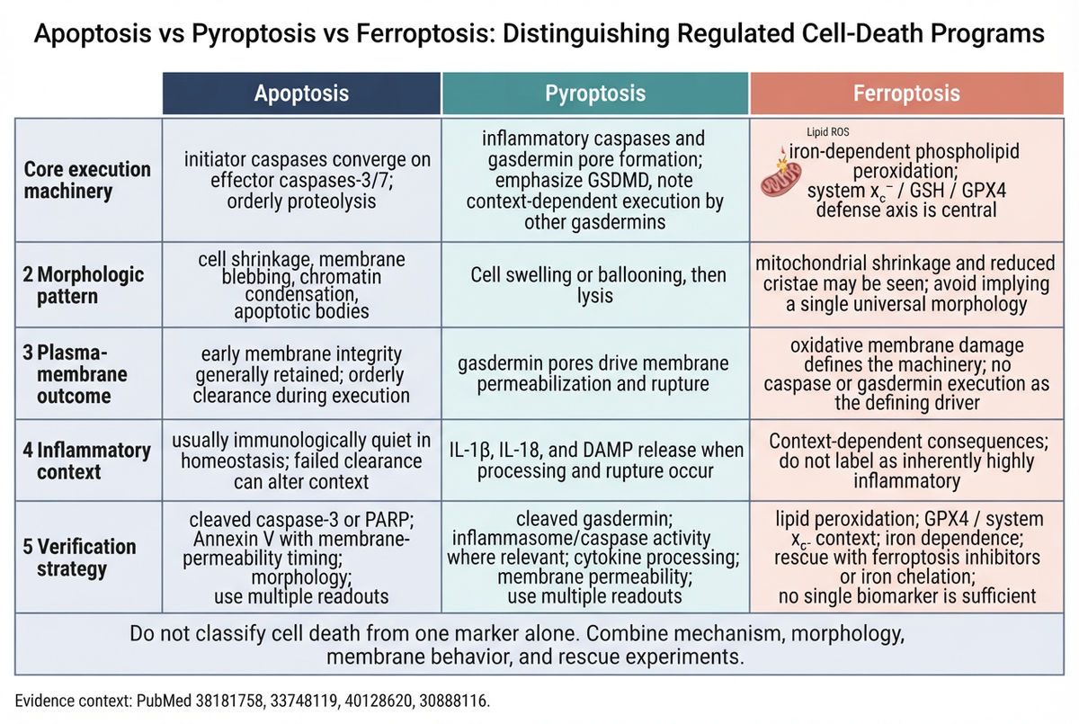
Those shortcomings were useful because they made the revision test meaningful. We asked Noah to remove row numbers, use exactly five short row labels, shorten every cell, apply matched header icons, retain a neutral interpretation, and regenerate the figure as a true 16:9 canvas.Two broad cleanup attempts improved some elements but introduced malformed text in other cells. A final targeted correction repaired the ferroptosis execution phrase and the apoptosis verification wording while preserving the overall layout.
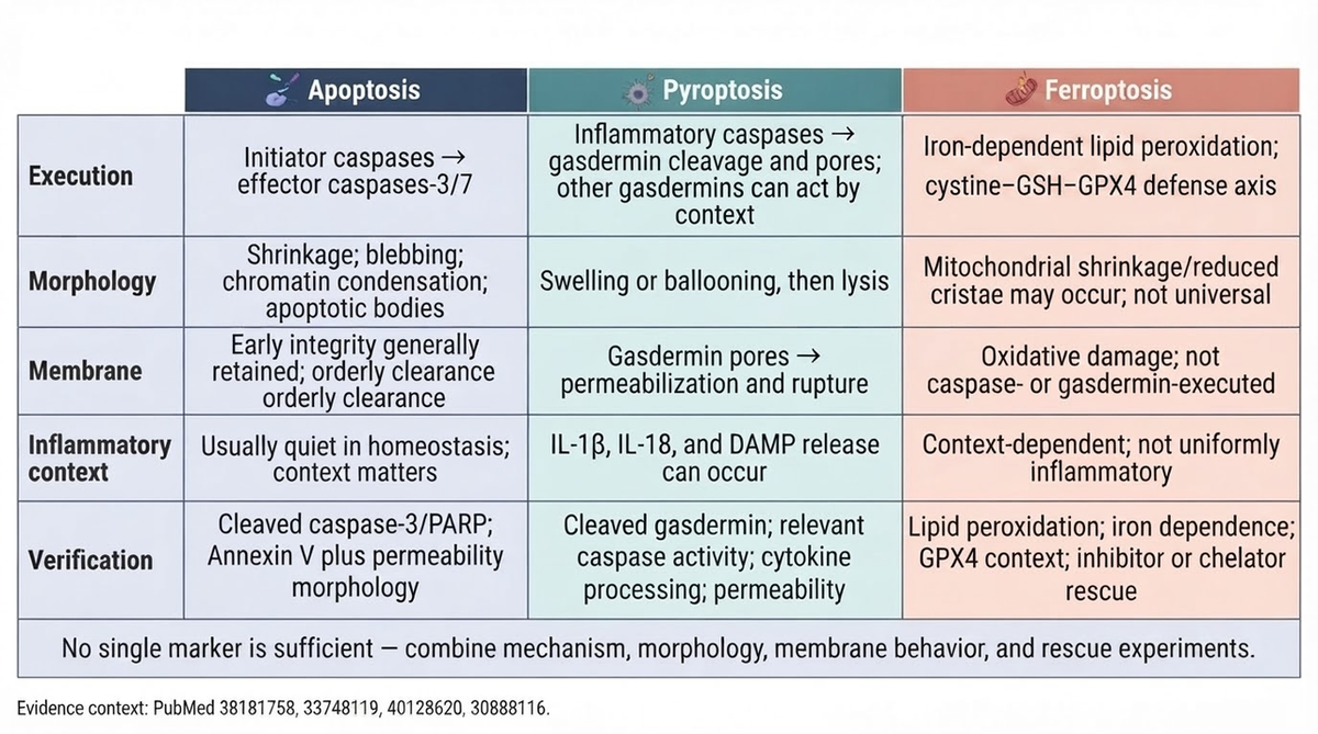
The revised image is materially better. It fixes the canvas ratio, inconsistent numbering, and unmatched header treatment. It also preserves the evidence footer and the important “no single marker” interpretation.
What the Noah case actually proves
- Evidence-to-structure translation. Noah did not merely supply scientific icons. It converted a biomedical question into five comparable analytical rows.
- Research-aware framing. The figure avoided inventing a universal winner or converting review literature into a diagnostic rule.
- Global revision by instruction. One revision changed aspect ratio, row labels, numbering, density, and header consistency across the full figure.
- A reviewable intermediate artifact. Researchers can react to a concrete draft earlier than they can when moving manually from papers to notes to a blank canvas.
The case does not prove perfect text rendering, editable vector output, or automatic journal compliance. Noah is most valuable as a research-to-figure bridge; exact labels and final production still deserve human control.
2. BioRender: best for manual biomedical asset assembly
BioRender is the closest direct alternative when the job is building a scientific schematic on a domain-specific canvas. Its official template gallery describes editable scientific icons and templates for publication-quality figures. This is useful when a researcher already knows the comparison rows and wants to assemble cells, proteins, organs, arrows, labels, and callouts manually.Choose BioRender over Noah when content interpretation is complete and object-level editability matters most. Choose Noah first when the team still needs to turn literature into a defensible comparison structure. A practical workflow can use Noah for the draft logic and BioRender for final manual reconstruction.
3. Canva: best for general comparison infographics
Canva is well suited to fast, approachable layouts. Its official infographic maker emphasizes a drag-and-drop editor, templates, charts, AI-assisted media, and real-time team collaboration. It works well for educational comparisons, presentation graphics, outreach material, and reports where brand consistency matters.Its limitation is domain specificity. Canva can make three columns look clean, but it does not inherently know whether caspase activation, membrane permeabilization, lipid peroxidation, and rescue experiments are being compared fairly. Bring validated scientific content to Canva rather than relying on the layout tool to create that content.
4. Bioicons plus Inkscape: best open-source workflow
Bioicons is an open collection of scientific illustrations, while Inkscape is a free, open-source vector editor centered on SVG. Together they provide a flexible alternative for labs that want reusable scientific assets and precise manual composition without a proprietary scientific-canvas subscription.This route is strongest when licensing, editable vectors, and custom assembly matter. It requires more design judgment and manual work than template-first tools. It also does not perform PubMed retrieval or propose the comparison argument.
5. Adobe Illustrator: best for exact vector finishing
Illustrator remains the precision option for teams that need fine control over paths, typography, layers, alignment, color, and professional export. It is especially useful when a figure must conform to strict journal dimensions or be integrated with other vector panels.That precision comes after the intellectual work. Illustrator will not decide which death-program distinctions are scientifically fair. It is best used once the evidence, hierarchy, and wording are stable—or as the finishing stage after an AI-assisted draft.
6. PowerPoint: best for familiar presentation-led comparisons
PowerPoint is often underestimated because it is not marketed as scientific illustration software. For internal reviews, lab meetings, grants, and research presentations, its shapes, tables, alignment guides, comments, and familiar editing model can be enough.It is a practical option when collaborators need to revise labels without learning new software. It is less suitable for complex molecular artwork, scalable vector production, or a workflow that begins with literature retrieval.
How to choose the right alternative
Start with the part of the task that remains difficult.
- Choose Noah AI when the bottleneck is converting PubMed-informed biomedical distinctions into a first comparison draft.
- Choose BioRender when the comparison logic is final and the bottleneck is manual assembly with biomedical assets.
- Choose Canva when the priority is a fast, branded infographic or presentation layout.
- Choose Bioicons plus Inkscape when the team wants an open-source scientific asset and SVG workflow.
- Choose Adobe Illustrator when exact vector control and publication finishing dominate.
- Choose PowerPoint when fast team handoff and familiar presentation editing matter most.
The best workflow may use two tools. Evidence synthesis and exact vector finishing are different jobs, and forcing one product to do both can create unnecessary friction.
Biomedical comparison figure QA checklist
Before publishing or presenting any AI-assisted biomedical comparison figure, check the following:
- Are the same criteria used across every column?
- Are the claims supported by the cited literature?
- Does any phrase imply a universal winner, diagnosis, or treatment recommendation without evidence?
- Are mechanism, morphology, membrane behavior, and verification kept conceptually distinct?
- Are Greek letters, minus signs, gene symbols, proteins, and abbreviations rendered correctly?
- Can every label be read at the final placement size?
- Are repeated, truncated, or malformed phrases removed?
- Does the caption explain that the figure is conceptual rather than raw experimental data?
- Has a domain expert reviewed the final artifact?
- Have the intended journal, institution, or client’s AI-disclosure and licensing rules been checked?
Frequently asked questions
What is the best Mind the Graph alternative for biomedical comparison figures?
Noah AI is the best fit here when the figure must begin with literature interpretation or a biomedical research question. BioRender is stronger for manual scientific asset assembly, while Illustrator or Inkscape is better for exact vector finishing.
Can Noah AI replace scientific review?
No. Noah can accelerate evidence retrieval, visual structuring, and revision, but researchers must verify every claim, label, symbol, and relationship. The live case in this article retained small text issues after several revisions.
Can I use an AI-generated biomedical comparison in a paper?
Policies vary by journal and institution. Treat the image as an assisted conceptual illustration, never as experimental evidence or raw data. Verify the science, retain source records, check licensing, and follow disclosure requirements before submission.
Is BioRender or Mind the Graph better for manual editing?
Both are designed around scientific visual assets and templates. The better choice depends on the exact icon coverage, collaboration needs, export requirements, licensing terms, and canvas workflow your team prefers. Test the intended figure before committing.
What is the best free option?
Bioicons plus Inkscape offers the clearest free and open-source combination in this list. It provides asset access and vector control, but the user must perform the scientific synthesis and layout manually.
Final takeaway
The closest-looking Mind the Graph alternative is not automatically the best product for a biomedical comparison figure. The better question is which part of the work remains difficult: interpreting evidence, assembling scientific assets, organizing a general infographic, collaborating in familiar software, or finishing precise vector artwork.The Noah cell-death case demonstrates a meaningful product advantage. Noah can turn a PubMed-framed biomedical question into a structured comparison draft, expose issues for researcher review, and respond to natural-language revisions across the whole figure. For researchers who otherwise move manually from papers to notes to a blank diagram, that research-to-figure bridge is more valuable than another icon library.
Turn your next biomedical question into a researcher-reviewable comparison figure with Noah AI.