
Best Mind the Graph Alternatives for Clinical Research Figures (2026)
Linda
Looking for Mind the Graph alternatives for clinical research figures? Compare Noah AI, BioRender, GraphPad Prism, and more to find the best tool for translating clinical evidence into structured, accurate visual summaries.
Mind the Graph is useful when researchers already know what they want to communicate and need scientific illustrations, templates, and a visual editor. Clinical research figures, however, create a different problem. A trial-design or results figure must preserve treatment arms, denominators, analysis populations, time points, endpoint definitions, and statistical qualifiers. A polished layout is not enough if the visual quietly changes the evidence.
Quick answer: Noah AI is the strongest alternative in this comparison when the difficult step is turning published clinical evidence into a structured figure draft. BioRender is better for manually assembling a familiar trial-flow diagram from curated scientific assets. GraphPad Prism is better for statistical charts built from analyzable data. R with ggplot2 is better for fully reproducible custom plots. Canva is better for assembling the complete poster or slide. Inkscape is better for precise vector cleanup.Create a literature-informed clinical research figure with Noah AI.
Quick comparison
| Tool | Best clinical-research use | Evidence or data connection | Free access | Main limitation |
|---|---|---|---|---|
| Noah AI | PubMed-informed trial-design and results-summary figures | Searches literature, structures the evidence, generates the figure, and accepts natural-language revisions | 20 free generations advertised | Exact text and clinical structure still require expert QA |
| BioRender | Manual trial-flow diagrams and biomedical illustration | Scientific templates and editable assets; the researcher supplies and verifies the trial facts | Free account available for templates | Not a substitute for evidence extraction or statistical analysis |
| GraphPad Prism | Kaplan-Meier curves, Cox regression, ROC curves, and statistical graphs | Directly analyzes entered research data | Free trial advertised | Not designed to synthesize papers into an illustrated trial overview |
| R + ggplot2 | Reproducible forest plots, outcome charts, and custom figures | Code and source data define every mark | Free and open source | Requires coding and a validated analysis workflow |
| Canva | Complete poster, slide, and team handoff | Charts and evidence are supplied separately | Free research templates available | General design system rather than a clinical-evidence tool |
| Inkscape | Exact vector cleanup and print finishing | No built-in literature or statistics workflow | Free and open source | Manual layout, asset sourcing, and clinical validation |
What question is this article actually answering?
The search is not simply “What looks like Mind the Graph?” The practical question is:Which tool can help me create a trustworthy clinical research figure for a paper, poster, or presentation without losing the trial structure or the meaning of the results?That changes the comparison. Clinical research figures can include CONSORT-style participant flow, parallel treatment arms, endpoint cards, Kaplan-Meier plots, subgroup forest plots, timelines, or a compact visual summary of published results. No single product is best at all of those jobs.The final product tested in this article is one horizontal clinical-trial overview figure that combines:
- the study population and randomization;
- two correctly separated treatment journeys;
- explicit analysis-population context;
- published pCR and event-free-survival results;
- source identifiers and a clinical-use caution.
What makes a clinical research figure different?
A mechanism illustration can be scientifically wrong because an arrow points in the wrong direction. A clinical research figure can be wrong in quieter ways: an interim analysis may appear to use the full randomized population; treatment phases may be merged; a percentage may lose its time point; or a hazard ratio may appear without its confidence interval.Before accepting any clinical figure, verify at least:
- Population: Does the disease stage and eligibility context match the source?
- Denominator: Is each result attached to the correct analysis population?
- Trial structure: Are randomization, treatment arms, surgery, crossover, and follow-up represented correctly?
- Endpoint: Is the metric named and defined accurately?
- Time point: Does an EFS, OS, response, or safety value retain its time horizon?
- Statistics: Are confidence intervals, hazard ratios, and analysis qualifiers preserved?
- Scope: Does the visual avoid turning trial-level evidence into patient-level advice?
How we evaluated the alternatives
We compared each tool against five jobs that commonly appear in a clinical-figure workflow:
- evidence retrieval and source traceability;
- accurate trial-flow construction;
- statistical visualization from research data;
- presentation or poster assembly;
- exact vector correction before publication.
Only Noah received a hands-on case because its claimed differentiator is the research-to-figure bridge. The other products are positioned from their official documentation and templates rather than superficial “tests” that would not reflect expert use.
1. Noah AI: best for evidence-to-clinical-figure synthesis
Noah’s official scientific-figure page advertises PubMed retrieval, structured figure generation, follow-up revision, and 20 free generations. Its clinical-trial-design example also makes it directly relevant to this search intent. The important question is whether that workflow produces a reviewable clinical artifact, not merely whether the interface can generate an image.
Real case: KEYNOTE-522 trial design and published efficacy results
We asked Noah to create a horizontal overview of KEYNOTE-522 in early triple-negative breast cancer. The evidence specification prioritized the pathological-complete-response publication (PMID 32101663), the event-free-survival publication (PMID 35139274), and NCT03036488.The requested figure had three zones:
- population and 2:1 randomization of 1,174 participants;
- parallel neoadjuvant, surgery, and adjuvant treatment tracks;
- two published result cards: pCR and 36-month EFS.
Noah’s retrieved-reference panel surfaced the KEYNOTE-522 EFS publication and an FDA approval summary. It did not surface the prioritized pCR primary paper in the final reference overview, even though the PMID and verified number were supplied in the prompt. That is useful evidence of both value and boundary: the task connected the image to relevant clinical sources, but the researcher still had to confirm source completeness.
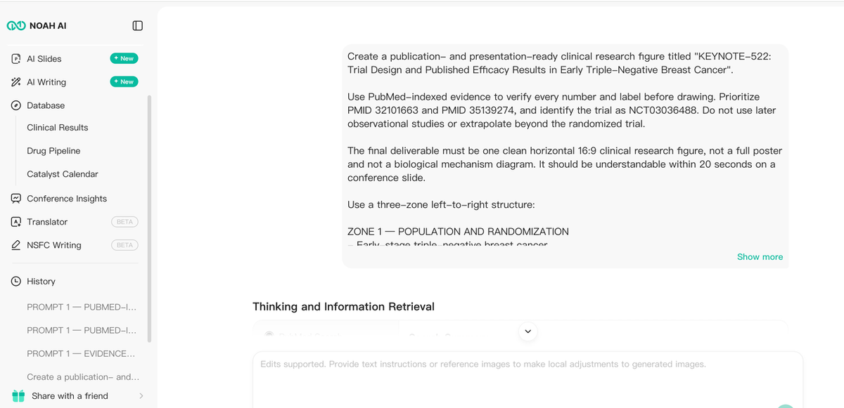
Figure 1. Noah’s reference overview connects the task to relevant PubMed records.
What the first output accomplished—and got wrong
The first downloaded output was 1264 × 848. It correctly displayed the randomized population, arm sizes, pCR values, the first-602-participant note, 36-month EFS values, hazard ratio, confidence interval, PMIDs, and a caution.However, its treatment journey contained a major structural error: pembrolizumab and placebo rows appeared inside both randomized-arm tracks. Visually, the result looked organized; clinically, it implied four treatment rows instead of two. It also ignored the requested 16:9 aspect ratio.
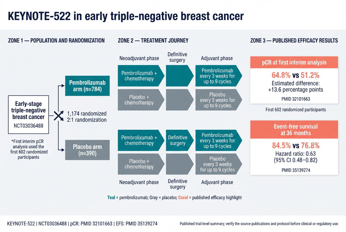
Figure 2. The first Noah output preserved many published values but duplicated the treatment rows.
Human review converted the clinical critique into a global revision
The revision prompt did not say “make it better.” It specified exactly two continuous tracks:
- pembrolizumab + chemotherapy → surgery → adjuvant pembrolizumab;
- placebo + chemotherapy → surgery → adjuvant placebo.
It also required one surgery block per track, equal track lengths, a true horizontal canvas, and unchanged efficacy cards
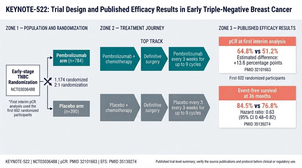
Figure 3. The final Noah revision fixes the trial-arm structure and aspect ratio. One duplicated phrase remains, so the figure is a strong review draft rather than publication-ready artwork.
What the Noah case actually proves
The case supports three specific product advantages:
- Evidence and visual synthesis can share one task. The figure, clinical explanation, citations, and revision history stay together instead of being split across a search tool, notes, and a blank canvas.
- Feedback can target clinical logic, not only appearance. A natural-language instruction corrected the randomized-arm structure and changed the global canvas without rebuilding the figure manually.
- The prompt can define evidence boundaries. The user prohibited unsupported OS, subgroup, safety, treatment-recommendation, and Kaplan-Meier content.
The case does not prove autonomous publication readiness. Source completeness, exact labels, denominators, statistics, and regulatory wording still require accountable human review.Choose Noah if: your bottleneck is translating literature and trial facts into a structured clinical figure candidate that a researcher can inspect and revise.
2. BioRender: best for manual clinical-trial flow diagrams
BioRender offers editable clinical-trial templates, including parallel randomized-trial flow charts and platform-trial designs. Its strength is visual assembly: users can start with familiar scientific assets and manually place enrollment, randomization, treatment, follow-up, and outcome elements.That makes BioRender a strong alternative when the protocol and result language have already been approved. It is less suited to the earlier evidence job. A template does not decide which analysis population belongs under a percentage or whether a hazard ratio has the right time point.Choose BioRender if: you already have a validated trial schematic and want a polished, editable biomedical layout.
3. GraphPad Prism: best for clinical statistical graphs
GraphPad Prism is the better choice when the figure is fundamentally a statistical analysis. Its official feature pages cover Kaplan-Meier survival analysis, Cox proportional-hazards regression, ROC curves, effect-size reporting, and customizable scientific graphs.Prism should not be replaced by an illustration generator when the deliverable requires analysis of participant-level or aggregate data. In the KEYNOTE-522 case, we intentionally prohibited an invented Kaplan-Meier curve because the prompt did not supply time-to-event data. A schematic EFS card and an analyzed survival plot are different artifacts.Choose GraphPad Prism if: your core output is a validated statistical graph created from research data rather than a literature-derived clinical overview.
4. R with ggplot2: best for reproducible custom clinical figures
ggplot2 is a declarative visualization system: the data, aesthetic mappings, layers, scales, and facets are represented in code. For clinical teams with statistical-programming capability, that makes it a strong no-license-cost option for reproducible outcome plots, forest plots, subgroup displays, and complex multi-panel figures.The tradeoff is effort. R does not retrieve and interpret the relevant papers, select the clinical message, or automatically create an illustrated treatment journey. It is strongest after a validated dataset and analysis plan exist.Choose R and ggplot2 if: auditability, repeatability, and exact data-to-mark control matter more than no-code speed.
5. Canva: best for assembling the complete poster or presentation
Canva provides free research-poster and research-presentation templates, including medical and clinical-trial-oriented layouts. It is useful for combining a title, authors, institutional branding, charts, references, QR codes, and approved figure assets in one collaborative environment.Its limitation is scientific validation. Canva can arrange the KEYNOTE-522 figure, but it will not independently determine whether the pCR denominator, treatment tracks, or confidence interval are correct.Choose Canva if: the evidence and figures are already approved and the remaining job is complete poster or slide assembly.
6. Inkscape: best free option for exact vector finishing
Inkscape is a free, open-source vector editor for Windows, macOS, and Linux. It supports SVG and can import or export formats including PDF, EPS, and PNG. It is the strongest no-cost choice in this list for correcting exact text, aligning objects, preparing print-safe output, and rebuilding a raster draft as editable vectors.For the Noah case, Inkscape would be an appropriate final step to remove the duplicated “every 3” phrase and standardize the population label. It would not retrieve the trial publications or verify the result values.Choose Inkscape if: exact final control matters more than automated evidence-to-figure generation.
Which alternative should you choose?
- Choose Noah AI for PubMed-informed clinical overview figures and natural-language structural revision.
- Choose BioRender for hands-on clinical-trial diagrams built from editable scientific assets.
- Choose GraphPad Prism for survival, diagnostic, regression, and other analyzed clinical graphs.
- Choose R + ggplot2 for reproducible custom figures driven by validated data and code.
- Choose Canva for the complete poster or presentation layout.
- Choose Inkscape for precise vector cleanup and print finishing.
The strongest workflow may combine tools: verify the evidence, draft the clinical overview in Noah, review every clinical statement, create data-driven statistical panels in Prism or R, and finish the presentation or poster in Canva, BioRender, or a vector editor.
Clinical research figure checklist
Before generation:
- define the single communication job;
- list exact source publications, registry identifiers, and data cutoffs;
- attach every value to its denominator, analysis population, and time point;
- separate trial-design elements from results;
- prohibit unsupported extrapolation and patient-level advice.
After every generation or revision:
- trace each number back to the source;
- confirm randomization and treatment paths;
- inspect endpoints, time points, confidence intervals, and footnotes at 100% zoom;
- reject invented curves or decorative data marks;
- correct exact text in an editable environment before publication.
Frequently asked questions
What is the best Mind the Graph alternative for clinical trial figures?
Noah is the strongest choice here for turning published clinical evidence into a structured overview draft. BioRender is stronger for manual trial-flow assembly, while Prism or R is stronger for statistical plots generated from data.
Can AI-generated clinical figures be publication-ready without review?
No. The KEYNOTE-522 case shows why. Noah corrected a major track-structure problem after feedback, but exact wording still needed manual cleanup. Clinical and statistical review remain mandatory.
Should Noah generate Kaplan-Meier curves from a paper summary?
Not as a substitute for a validated survival analysis. A paper can support an endpoint card with a published estimate and hazard ratio. A Kaplan-Meier curve should come from appropriate time-to-event data or an authorized source figure, with correct censoring and number-at-risk information.
Is there a completely free workflow?
R with ggplot2 and Inkscape are free and open source. Canva offers free templates, and Noah advertises 20 free generations. Export rights, licensing, and plan limits should always be rechecked before publication.
Final takeaway
The closest-looking Mind the Graph alternative is not automatically the best product for a clinical research figure. The better question is which part of the work remains difficult: retrieving evidence, preserving the trial design, analyzing participant data, assembling a poster, or finishing exact vector artwork.The Noah KEYNOTE-522 case demonstrates a meaningful product advantage. Noah can turn a clinical evidence question into a literature-connected figure draft, expose structural problems for review, and respond to natural-language revisions that change the global trial layout. For researchers who otherwise move manually from papers and registry records to notes and a blank canvas, that evidence-to-figure bridge is more valuable than another icon library.The same case also establishes the correct boundary: a clinical figure is not finished until a qualified reviewer verifies every source, denominator, treatment path, endpoint, time point, statistic, and label.
Turn your next clinical research question into a researcher-reviewable figure with Noah AI.